Redesigning the Blood Donation Experience
How might we make future blood donation centers more welcoming for first time donors?

CHALLENGE
The National Health Services requires 6,000 blood donations a day and 2,000 new donors every year. With half of their repeat donors over 45 years old, the NHS needed to attract younger donors. The NHS worked with Common Good to create a new experience and service guidelines for future blood donation centers.
I completed this professional project with interior design partner, No Chintz while interning with Common Good.
PROBLEM
Interviews revealed that the primary deterrent for donation blood was that the centers and process was found to be intimidating, confusing, and unfriendly. Potential donors were overwhelmed by the clutter of the centers, the haphazard signage, and open plan layouts.
PROPOSAL
The proposed design for new blood donation centers focused on:
Improving the donor flow through the space
Easing the anxiety of first-time donors
Maximizing flexibility of the space with modular furniture to adapt to center real estate and changing center needs
Proposed Design
INTUITIVE FLOW FOR DONORS
We simplified the flow of donors through the space. The physical layout and incremental sign posting prepares and directs donors to the next station. We moved the staff functions to the back and grouped donor-related activities to the front.

EASE ANXIETY
The center is designed to help donors relax and feel secure. At the entrance donors see when entering the center are sign in kiosks and a friendly staff member to help them check in. A storage space is available for donors to stash their belongings.
The waiting room utilizes a blue and green color palette to create a calming atmosphere. The walls and ceilings have inspiring messaging and art to keep the mind busy. We chose a mix of furniture options to give the donors a chance to sit comfortably and chat among themselves.


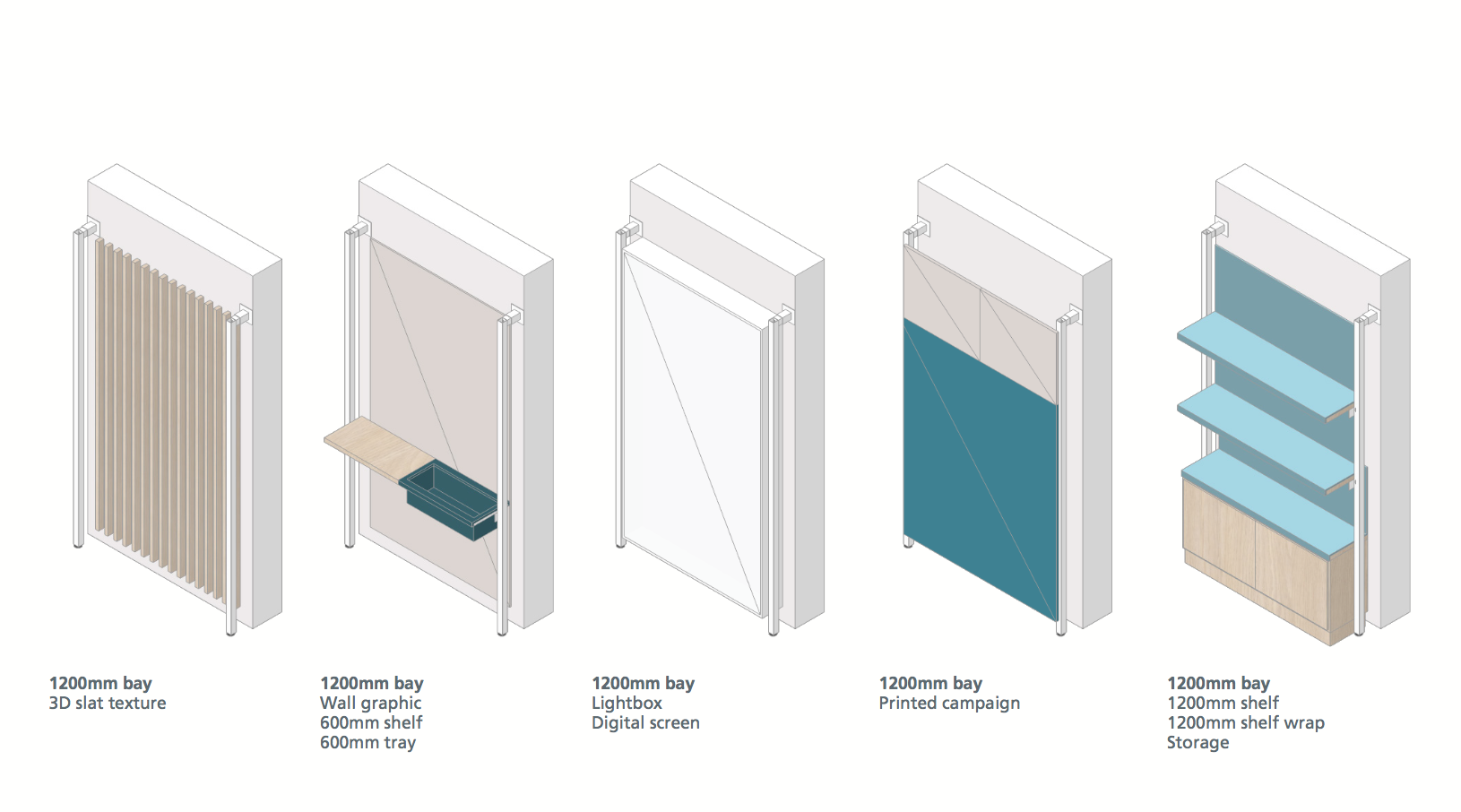
MAXIMIZE FLEXIBILITY
We proposed modular furnishing to maximize flexibility in the space. This allows the design to be applied to future donation centers, regardless of the shape of the space. The donors and staff can adjust their environment to fit their needs.

The Process
The team and I visited 6 donation centers in the U.K. to talk to staff and donors. We also conducted empathy research by donating blood ourselves at our local NHS blood donation center in Manchester.
In our research, we found that first-time donors feel intimidated and unwelcome. They were confused by the open layout and the lack of way-finding signage. Donors were handed extensive literature about the donation process, but most were overwhelmed by the amount of information and confused by the medical jargon.
OBSERVATION & INTERVIEWS & MAPPING


A large part of our research phase was dedicated to exploring how color impacts the donation experience. The donation centers had varied color palettes and were covered in red decorations and signs, which made some new donors feel queasy and unsettled.
We tested color combinations and color proportions with donors and staff members at 3 donation centers. We found that blues and greens were the most calming while oranges and yellows were the most celebratory. I created the visuals for the mood boards and analyzed the survey results. I used a mix of quick excel to collate the results and used python scripts to generate visuals to share our results to stakeholders.
EXPLORING THE IMPACT OF COLOR

As we tested our mood boards, we found that we could not separate the details (furnishing, lighting, etc.) of the photos from the colors. Donors would naturally focus on whether they liked a couch instead of on the different colors.
To mitigate this, I explored how to test new color schemes in Virtual Reality. Instead of a physical build out, VR provides a more immersive environment in a shorter amount of time. After a bit of experimenting, I used a mix of quick Photoshop and ready made VR platforms, like Google Streetview and Roundme, to create a prototype that kept the furnishing the same and only adjusted the color (my tutorial is in this Medium article).
My prototype was a proof of concept for the power of VR. In internal trials, we found that this method significantly changed the mood of a space solely by changing colors. While we were not able to test this approach with donors, we presented our final design to our client in VR.
PROTOTYPING IN VIRTUAL REALITY

Following our research phase, we conducted a week-long sprint with NHS stakeholders and project partners. During the week we presented our findings and conducted co-design sessions. I ran a "future thinking" workshop, a few different brainstorming sessions, and taught different techniques to evaluating options.
We were able to get a deeper understanding of where the NHS is headed and where stakeholders believe the medical field is heading. The brainstorming sessions led us to develop principles that No Chintz was able to take and create a final design for.
IDEATION & CO-DESIGN

